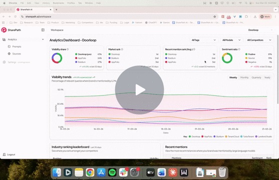
Understanding Your Analytics Dashboard
Your Analytics Dashboard answers one question:
How visible is your brand when people ask AI for recommendations in your space?
Everything on this dashboard is based on the prompts you've set up. Better prompts means more useful data. If you haven't set up your prompts yet, start there first.

Your Health Check: The Four Key Metrics
At the top of the dashboard, you'll see four cards. Together, they give you an instant snapshot of how your brand is performing in AI search.

Visibility Share
Out of all the prompts you're tracking, how often does your brand show up compared to competitors? Think of it as your share of the AI conversation.
If you have a 46% visibility share and your closest competitor has 27%, you're showing up in almost half the AI responses for the topics you care about.
Market Rank
When an AI responds to a query and lists multiple brands, where do you land in that list? First? Third? Fifth?
This is your overall average position across all tracked prompts. A rank of 1st means that, on average, AI mentions your brand before anyone else.
Recent Mention Rank
This is similar to Market Rank, but based only on your most recent mentions.
Why does this matter? Because if your overall rank is strong but your recent rank is dropping, something changed. Maybe a competitor published new content. Maybe the AI model updated. This is your early warning signal.
Think of it this way: Market Rank is your grade for the semester. Recent Mention Rank is your grade this week. If this week's grade is slipping, you want to know now, not at the end of the semester.
Sentiment Ratio
This one is important. It's not just about whether you're mentioned. It's about how you're mentioned.
Are LLMs recommending you? Or warning people away?
You can have high visibility and negative sentiment. That's actually worse than not showing up at all. A positive sentiment of 84% means the AI is speaking well about your brand in the vast majority of responses.
Visibility Trends

This chart tracks your visibility over time against your competitors. You can toggle between weekly, monthly, quarterly, and yearly views.
What you're looking for:
- Trending up? Your content strategy is working.
- Flat? You're holding steady, but competitors might catch up.
- Losing ground? Something changed and you need to dig in.
If you see a competitor start climbing, that's your signal to act.
Industry Ranking Leaderboard

This shows where you rank against competitors over the last 30 days, sorted by visibility percentage. It's your broader competitive snapshot.
Each competitor has a trend indicator next to their score so you can quickly see who is gaining or losing ground.
Recent Mentions

This table shows the actual prompts where your brand was mentioned by an AI, along with two key details:
- Sentiment: Was the mention positive, neutral, or negative?
- Rank: Where did you appear in that specific response?
You'll notice some mentions show "N/A" for rank. This means the AI wasn't comparing multiple brands in that response, so a ranking doesn't apply. For example, if someone asks "Is DoorLoop support helpful after purchase?" the AI is only talking about one brand, so there's no ranking.
Using Filters to Drill Down

At the top of the dashboard, you have three filters:
- Tags: Filter by prompt categories you've set up. This could be a specific audience segment, product feature, user intent, or industry. For example, you can filter to just "property management software" prompts and see how you perform on that specific topic.
- Models: See how you perform in specific AI models like ChatGPT vs. Gemini vs. Claude.
- Competitors: Focus on how you compare against a single competitor.
Tags are especially useful. By narrowing down to a specific set of prompts, you can spot opportunities you'd miss in the overall view. For instance, your overall visibility might be strong at 44%, but when you filter to high-intent purchase prompts, it might drop. That tells you exactly where to focus your content efforts.
So What Do I Do With This?
The dashboard is designed to help you find gaps. Look for:
- Prompts where you're not showing up but should be
- Areas where your sentiment is off or trending negative
- Competitors that are climbing in visibility
Each gap is a content opportunity. And that's exactly what SharePath Paths are built to help you close.